Introduction to R - Introduzione a R
Some simple graphics
To produce a scatterplot of the first and third column of the dataframe dat, with colors changing according to the species, type:
> plot(dat[,1],dat[,3],pch=20,xlab=colnames(dat)[1],ylab=colnames(dat)[3],col=dat[,5])
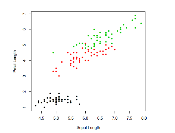
From the graph evidence of a strong correlation between the two measures is apparent, then we compute the correlation matrix of all numeric columns in dat, we round the results at the second decimal figure:
> ### correlation
> round(cor(dat[,-5]),2)
| Sepal.Length | Sepal.Width | Petal.Length | Petal.Width | |
| Sepal.Length | 1.00 | -0.12 | 0.87 | 0.82 |
| Sepal.Width | -0.12 | 1.00 | -0.43 | -0.37 |
| Petal.Length | 0.87 | -0.43 | 1.00 | 0.96 |
| Petal.Width | 0.82 | -0.37 | 0.96 | 1.00 |
The function text can be used to add the correlation value to the plot.
> plot(dat[,1],dat[,3],pch=20,xlab=colnames(dat)[1],ylab=colnames(dat)[3],col=dat[,5])
> text(4.5,6.2,paste("corr.",round(cor(dat[,1],dat[,3]),2)))
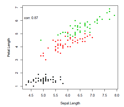
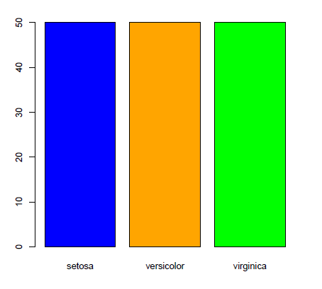
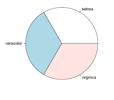
The function paste concatenates strings (to see all its options type ?paste). To obtain information on categorical quantities we need their frequency distributions, that is obtained by typing: table(dat$Species) Graphical representations for frequency distributions are the barplot and the pie chart:
> barplot(table(dat$Species),col=c("blue","orange","green"))
> pie(table(dat$Species))
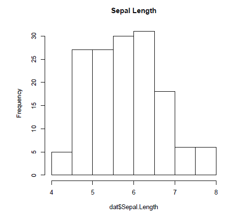
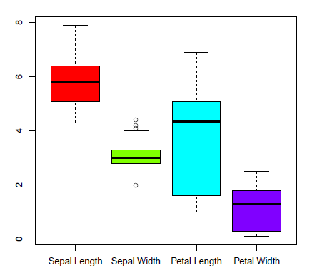
Relevant representations for numeric variables are histograms and boxplots:
> hist(dat$Sepal.Length,main="Sepal Length")
> boxplot(dat[,-5],col=rainbow(4))
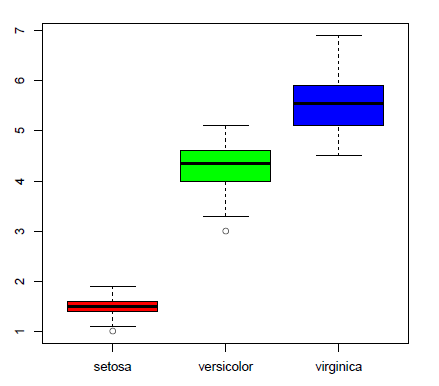
boxplot of one numeric variable with groups defined by a categorical factor
> boxplot(dat$Petal.Length~dat$Species,col=rainbow(3))
A large part of statistical procedures rely on the assumption that data are Gaussian. A simple graphical way to verify this assumption is trough quantile plots where empirical quantiles are compared to the standard normal theoretical quantiles (qq-plots).
> qqnorm(scale(dat$Sepal.Length))
> abline(c(0,1),col=2)
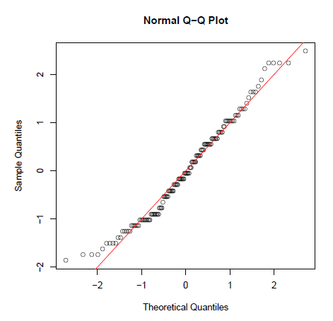
if points are close to the red line (the quadrant bisecting line) the normality assumption is acceptable.
The first R session is over. It is then possible to save all created objects using
> save.image("finalfirstsession.RData")
To remove all objects clearing the workspace type
> rm(list=ls())
Alcuni grafici semplici
Per realizzare un grafo a dispersione della prima e terza colonna del dataframe dat con colori diversi per specie, digitare:
> plot(dat[,1],dat[,3],pch=20,xlab=colnames(dat)[1],ylab=colnames(dat)[3],col=dat[,5])
Dal grafico si evince una forte correlazione fra le due misure, quindi si calcola la matrice di correlazione di tutte le colonne numeriche in dat, si arrotondano i risultati alla seconda cifra decimale:
> ### correlazione
> round(cor(dat[,-5]),2)
| Sepal.Length | Sepal.Width | Petal.Length | Petal.Width | |
| Sepal.Length | 1.00 | -0.12 | 0.87 | 0.82 |
| Sepal.Width | -0.12 | 1.00 | -0.43 | -0.37 |
| Petal.Length | 0.87 | -0.43 | 1.00 | 0.96 |
| Petal.Width | 0.82 | -0.37 | 0.96 | 1.00 |
La funzione text() puó essere usata per aggiungere il valore di correlazione sul grafico.
> plot(dat[,1],dat[,3],pch=20,xlab=colnames(dat)[1],ylab=colnames(dat)[3],col=dat[,5])
> text(4.5,6.2,paste("corr.",round(cor(dat[,1],dat[,3]),2)))
La funzione paste() concatena stringa (per vedere tutte le sue opzioni digitare ?paste). Per avere informazioni sulle quantitá categoriche si ha bisogno delle loro distribuzioni di frequenza, ottenuto digitando: table(dat$Species)
Le rappresentazioni grafiche delle distribuzioni di frequenza sono i grafici a barre o a torta:
> barplot(table(dat$Species),col=c("blue","orange","green"))
> pie(table(dat$Species))
Importanti rappresentazioni per variabili numeriche sono gli istogrammi e i boxplot:
> hist(dat$Sepal.Length,main="Sepal Length")
> boxplot(dat[,-5],col=rainbow(4))
boxplot di una variabile numerica con gruppi definiti da un fattore di categoria
> boxplot(dat$Petal.Length~dat$Species,col=rainbow(3))
Una grande parte delle procedure statistiche si basano sull'assunzione che i dati sono gaussiani. Un semplice modo grafico per verificare quasta assunzione é attraverso i i grafici di quantili, dove quantili empirici sono confrontati con i quantili teorici normali (qq-plots).
> qqnorm(scale(dat$Sepal.Length))
> abline(c(0,1),col=2)
se i punti sono vicini alla linea rossa (la linea bisettrice del quadrante), l'assunzione di normalitá é accettabile.
Terminata la prima sessione di R, é possibile salvare tutti gli oggetti creati con
> save.image("finalfirstsession.RData")
Per eliminare tutti gli oggetti e pulire lo spazio di lavoro, digitare:
> rm(list=ls())